Snakie is a snack ordering app that has most of your snacks just in one place.

problem:
Busy workers lack the time necessary to prepare a meal and has limited healthy meal options.
goal:
Design an app for Snakie that allows users to easily order and pick up fresh, healthy dishes.
responsibilities:
Conducting interviews, paper and digital wireframing, low and high-fidelity prototyping, conducting usability studies, accounting for accessibility, and iterating on designs.
my role:
UX designer designing an app for Snakie from conception to delivery.
sketches and paper wireframes

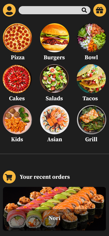
Taking the time to draft iterations of each screen of the app on paper ensured that the elements that made it to digital wireframes would be well-suited to address user pain points. For the home screen, I prioritized a quick and easy ordering process to help users save time.
digital wireframes
As the initial design phase continued, I made sure to base screen designs on feedback and findings from the user research.


research study details
I conducted interviews and created empathy maps to understand the users I’m
designing for and their needs. A primary user group identified through research
was working adults who don’t have time to cook meals.
-
Time
Working adults are too busy to spend time on meal preparationVariety
Users can’t find what they want due to poor variety of meals
Accessibility
Platforms for ordering food are not equipped with assistive technologies
IA
Text-heavy menus in apps are often difficult to read and order from
-
Mapping user journey revealed how helpful it would be for users to have access to a dedicated Snakie app.
-
This user group confirmed initial assumptions about Snakie customers, but research also revealed that time was not the only factor limiting users from cooking at home. Other user problems included obligations, interests, or challenges that make it difficult to get groceries for cooking or go to restaurants in-person.
usability study
I conducted two rounds of usability studies. Findings from the first study helped guide the designs from wireframes to mockups. The second study used a high-fidelity prototype and revealed what aspects of the mockups needed refining.
-
Users want to order quickly
Users want more customization options
Users want a delivery option
-
The checkout process has too many unnecessary steps
Customization functionality is confusing
final design


prototype
prototype

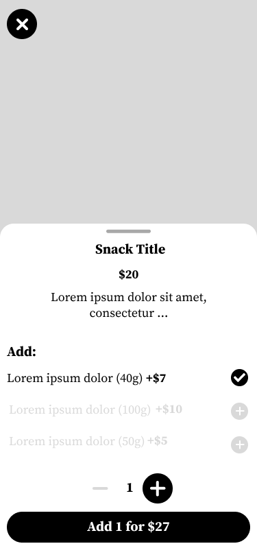
The final high-fidelity prototype presented cleaner user flows for building custom orders and checkout. It also meet user needs for a pickup or delivery option as well as more customization.
conclusion
conclusion
next steps
Conduct another round of usability studies to validate whether the pain points users experienced have been effectively addressed.
Conduct more user research to determine any new areas of need.
Based on the feedback gathered from user testing, I can continue to refine and iterate on the design of the app, making adjustments and improvements as needed to ensure that it meets the needs of its users. This process can continue throughout the life cycle of the app, as new user feedback and data become available.
the app makes users feel like Snackie really thinks about how to meet their needs.
One quote from peer feedback:
“The app made it so easy and fun to order snacks for the whole family! I would definitely use this app as a go-to for a delicious, fast, and even healthy meal.”
While designing the Snackie app, I learned that the first ideas for the app are only the beginning of the process. Usability studies and peer feedback influenced each iteration of the app’s designs.
