Grad.me is a platform for graduates who are looking for their first job. We help graduates to create their online Profile so that companies could invite them as well. We make it easy to collaborate, find internships and jobs.
Most of the current platforms doesn’t have enough options for graduates or doesn’t allow graduates to collaborate/ message companies directly.
Design an app to help graduates in finding their first job/internship.
problem:
goal:
initial design concepts
user research
I used Grad.me data on college graduates to develop interview questions, which were then used to conduct user interviews. The feedback received through research made it very clear that college graduates are missing their own platform with advanced search and filtration to apply to Internships/Jobs.
I did a quick ideation exercise to come up with ideas for how to address gaps identified in the competitive audit. My focus was specifically on advanced filter for the Search.
usability study
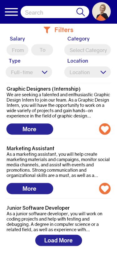
Additional design changes included adding advanced filters were made after usability study.
Changes:
Advanced search, filtering and category options.
before usability study
after usability study
With the app designs completed, I started work on designing the responsive website. I used the Grad.me sitemap to guide the organizational structure of each screen’s design to ensure a cohesive and consistent experience across devices.
responsive designs
The designs for screen size variation included mobile, tablet, and desktop. I optimized the designs to fit specific user needs of each device and screen size.
prototype
The high-fidelity prototype followed the same user flow as the low-fidelity prototype, including design changes made after the usability study.
conclusion
conclusion
By creating a user-centered and intuitive app, I aimed to help college graduates navigate the complex job search process with greater ease and confidence.
My designs aimed to streamline the job search process for college graduates and help them find relevant job opportunities faster, ultimately empowering them to launch their careers more quickly and effectively.
what I learned:
Throughout the project, I gained a deeper understanding of the importance of user research and how it informs the design process.
Through iterative prototyping and user testing, I learned the value of receiving feedback and making adjustments based on user needs and preferences.
I also developed a greater appreciation for the importance of designing for accessibility and inclusion, ensuring that all users can access and benefit from the app.
Overall, the project helped me improve my design skills and taught me valuable lessons about designing for real-world users and their needs.
next steps
Development and Implementation: After completing the research and design process, the next step would be to move into the development and implementation stage. This would involve working with developers and engineers to bring your design concepts to life in a functional app.
User Testing and Feedback: Once the app is developed, it's important to conduct user testing and gather feedback from users to identify any issues or areas for improvement. This feedback can be used to make adjustments to the app and improve its usability and effectiveness.
Iterative Design: Based on the feedback gathered from user testing, I can continue to refine and iterate on the design of the app, making adjustments and improvements as needed to ensure that it meets the needs of its users. This process can continue throughout the life cycle of the app, as new user feedback and data become available.


